
2017 speedo look...

pdedse

Moderator
Staff member
Thread starter
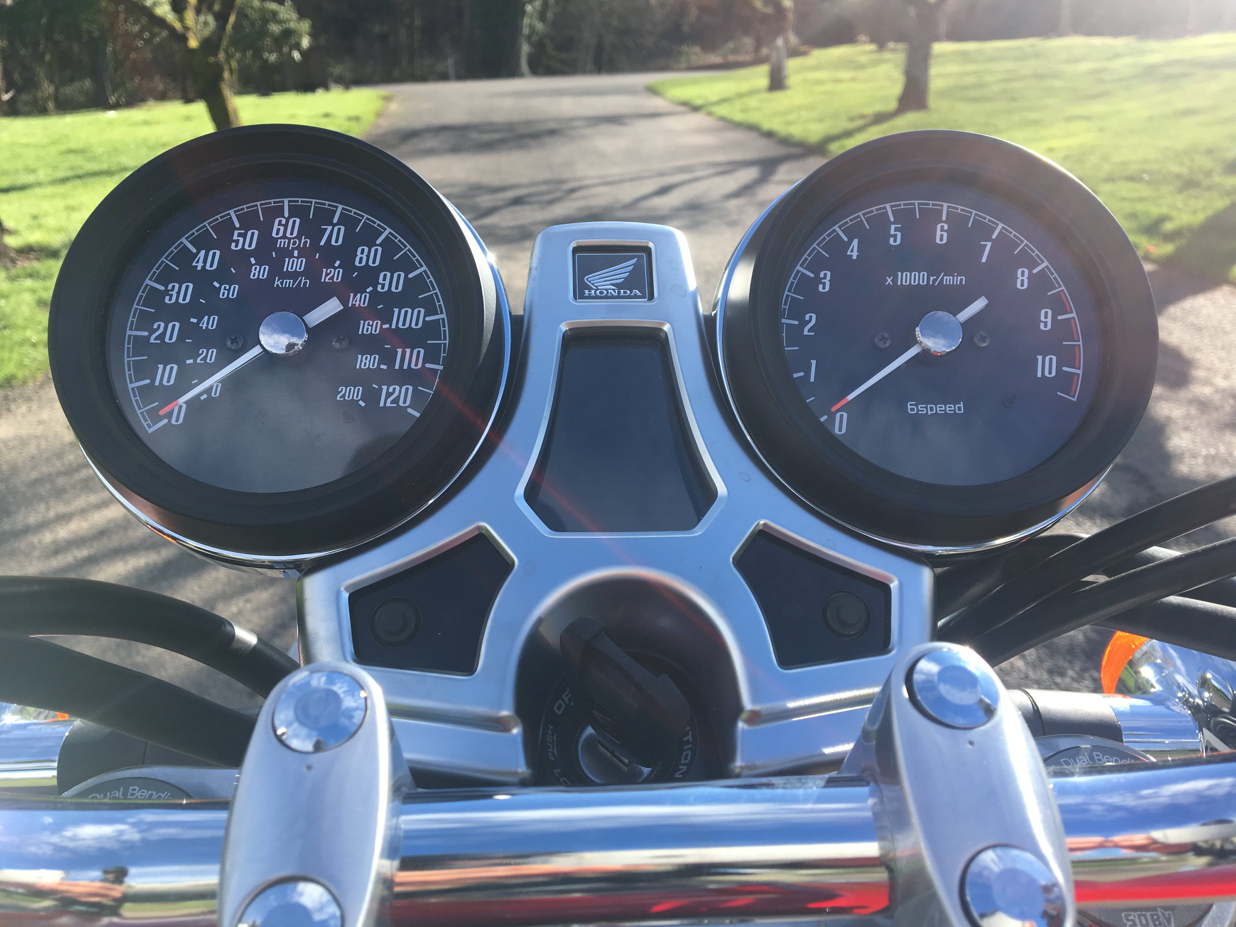
I have commented in the past, some others have well, about the 2017ex speedo look, that it's too busy with both mph and kph and the funny font.
df8af93dcc51d3a98d179b05dbc6082f.jpg


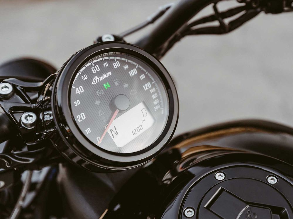
Care across some photos of the India Scout 2020, and this is what I'd rather see, whether miles per or kilometers, it wouldn't even matter to me. The font might even be the same, but it looks so uncluttered:
b5ad3a43b8c38de667f9d3434feb3ff4.jpg


Small fries, I know.
 
a 200 mph speedo? World Fastest Indian lol

yes in comparison the 17 speedo looks rather busy.
 
I like the 2013 gauges best, especially the green faces. Even though the stainless rims are not structurally needed, it reminds me of old Smiths gauges. But I have found the gear indicator increasingly useful.
 
Thread starter
Pekingduck...what CB is that bottom speedometer from? That's exactly the look I'd have given it. Balanced. The '17ex feels like it always pulls to the left--now I now why...it's the extra weight of that speedo lettering compared to the tach lettering.

EDIT: wait, is that one them thar photo shopped photos?!?!
 
pdedse_imp said:
Pekingduck...what CB is that bottom speedometer from? That's exactly the look I'd have given it. Balanced. The '17ex feels like it always pulls to the left--now I now why...it's the extra weight of that speedo lettering compared to the tach lettering.

EDIT: wait, is that one them thar photo shopped photos?!?!
Yessiree. If only life were that easy. As kids believe.
 
I love the angled font on the '17. The smaller second row of KPH digits doesn't bother me in the least. Makes it easier to differentiate the speedo from the tach at a quick glance. Some of my VWs had tachs that read 10, 20, 30, 40, 50, 60, 70 x 100 rather than the usual 1, 2, 3, 4, 5, 6, 7 x 1000, which made the tach look just like the speedo.

Yep, I'm fine with the numbers and fonts on the '17. I just wish they'd kept the green face.
 
The ferret_imp said:
a 200 mph speedo? World Fastest Indian lol

yes in comparison the 17 speedo looks rather busy.
To be fair, nowhere on the Indian speedometer do I see an indication of MPH. If that is the case, this clearly must have been part of Indian's "Dream (On) Package".

pekingduck_imp said:
I like the 2013 gauges best, especially the green faces. Even though the stainless rims are not structurally needed, it reminds me of old Smiths gauges. But I have found the gear indicator increasingly useful.
As do I, but I thought that Honda kept the green faces all this time. Is it not just a matter of a lack of lighting on the later model gauges?

VLJ_imp said:
I love the angled font on the '17. The smaller second row of KPH digits doesn't bother me in the least. Makes it easier to differentiate the speedo from the tach at a quick glance. Some of my VWs had tachs that read 10, 20, 30, 40, 50, 60, 70 x 100 rather than the usual 1, 2, 3, 4, 5, 6, 7 x 1000, which made the tach look just like the speedo.

Yep, I'm fine with the numbers and fonts on the '17. I just wish they'd kept the green face.
Has differentiating a speedometer from a tachometer in/on any sort of vehicle honestly been a problem for you?

Again, I thought the gauges were still green, but darker. Really not the case?
 
Guth_imp said:
The ferret_imp said:
a 200 mph speedo? World Fastest Indian lol

yes in comparison the 17 speedo looks rather busy.
To be fair, nowhere on the Indian speedometer do I see an indication of MPH. If that is the case, this clearly must have been part of Indian's "Dream (On) Package".

pekingduck_imp said:
I like the 2013 gauges best, especially the green faces. Even though the stainless rims are not structurally needed, it reminds me of old Smiths gauges. But I have found the gear indicator increasingly useful.
As do I, but I thought that Honda kept the green faces all this time. Is it not just a matter of a lack of lighting on the later model gauges?

VLJ_imp said:
I love the angled font on the '17. The smaller second row of KPH digits doesn't bother me in the least. Makes it easier to differentiate the speedo from the tach at a quick glance. Some of my VWs had tachs that read 10, 20, 30, 40, 50, 60, 70 x 100 rather than the usual 1, 2, 3, 4, 5, 6, 7 x 1000, which made the tach look just like the speedo.

Yep, I'm fine with the numbers and fonts on the '17. I just wish they'd kept the green face.
Has differentiating a speedometer from a tachometer in/on any sort of vehicle honestly been a problem for you?

Again, I thought the gauges were still green, but darker. Really not the case?
To be fair, nowhere on the Indian speedometer do I see an indication of MPH. If that is the case, this clearly must have been part of Indian's "Dream (On) Package".
Yea no indication, other than on most speedometer faces in mph, the 60 mph is at about 12 oclock or straight up as it is on the Honda faces. On the Indian face the 60 is also at about 12 oclock so I assumed it was a mph face.
 
Thread starter
pekingduck_imp said:
pdedse_imp said:
Pekingduck...what CB is that bottom speedometer from? That's exactly the look I'd have given it. Balanced. The '17ex feels like it always pulls to the left--now I now why...it's the extra weight of that speedo lettering compared to the tach lettering.

EDIT: wait, is that one them thar photo shopped photos?!?!
Yessiree. If only life were that easy. As kids believe.
Hhahaa....I just now realized that both photos were actually my own! I need to get out of the house.
 
The ferret_imp said:
Guth_imp said:
The ferret_imp said:
a 200 mph speedo? World Fastest Indian lol

yes in comparison the 17 speedo looks rather busy.
To be fair, nowhere on the Indian speedometer do I see an indication of MPH. If that is the case, this clearly must have been part of Indian's "Dream (On) Package".

pekingduck_imp said:
I like the 2013 gauges best, especially the green faces. Even though the stainless rims are not structurally needed, it reminds me of old Smiths gauges. But I have found the gear indicator increasingly useful.
As do I, but I thought that Honda kept the green faces all this time. Is it not just a matter of a lack of lighting on the later model gauges?

VLJ_imp said:
I love the angled font on the '17. The smaller second row of KPH digits doesn't bother me in the least. Makes it easier to differentiate the speedo from the tach at a quick glance. Some of my VWs had tachs that read 10, 20, 30, 40, 50, 60, 70 x 100 rather than the usual 1, 2, 3, 4, 5, 6, 7 x 1000, which made the tach look just like the speedo.

Yep, I'm fine with the numbers and fonts on the '17. I just wish they'd kept the green face.
Has differentiating a speedometer from a tachometer in/on any sort of vehicle honestly been a problem for you?

Again, I thought the gauges were still green, but darker. Really not the case?
To be fair, nowhere on the Indian speedometer do I see an indication of MPH. If that is the case, this clearly must have been part of Indian's "Dream (On) Package".
Yea no indication, other than on most speedometer faces in mph, the 60 mph is at about 12 oclock or straight up as it is on the Honda faces. On the Indian face the 60 is also at about 12 oclock so I assumed it was a mph face.
To be fair, nowhere on the Indian speedometer do I see an indication of MPH. If that is the case, this clearly must have been part of Indian's "Dream (On) Package".
Yea no indication, other than on most speedometer faces in mph, the 60 mph is at about 12 oclock or straight up as it is on the Honda faces. On the Indian face the 60 is also at about 12 oclock so I assumed it was a mph face.
As would I if I'm being honest. I just get a kick out of how the last 80 MPH of the speedometer's range is all bunched up. It's as if the only way you're going to realize 200 MPH on that bike is if you hit a good size bump or pothole while doing 120 MPH and it jolts the needle all the way to the 200 MPH mark. :biker:
 
Thread starter
VLJ_imp said:
I love the angled font on the '17. The smaller second row of KPH digits doesn't bother me in the least. Makes it easier to differentiate the speedo from the tach at a quick glance. Some of my VWs had tachs that read 10, 20, 30, 40, 50, 60, 70 x 100 rather than the usual 1, 2, 3, 4, 5, 6, 7 x 1000, which made the tach look just like the speedo.

Yep, I'm fine with the numbers and fonts on the '17. I just wish they'd kept the green face.
Agreed. I thought it was like a rule or somethin' that Honda CBs had to have green speedo / tach. Oh well...good to see you on the forum from time to time.
Guth_imp said:
The ferret_imp said:
a 200 mph speedo? World Fastest Indian lol

yes in comparison the 17 speedo looks rather busy.
To be fair, nowhere on the Indian speedometer do I see an indication of MPH. If that is the case, this clearly must have been part of Indian's "Dream (On) Package".

pekingduck_imp said:
I like the 2013 gauges best, especially the green faces. Even though the stainless rims are not structurally needed, it reminds me of old Smiths gauges. But I have found the gear indicator increasingly useful.
As do I, but I thought that Honda kept the green faces all this time. Is it not just a matter of a lack of lighting on the later model gauges?

VLJ_imp said:
I love the angled font on the '17. The smaller second row of KPH digits doesn't bother me in the least. Makes it easier to differentiate the speedo from the tach at a quick glance. Some of my VWs had tachs that read 10, 20, 30, 40, 50, 60, 70 x 100 rather than the usual 1, 2, 3, 4, 5, 6, 7 x 1000, which made the tach look just like the speedo.

Yep, I'm fine with the numbers and fonts on the '17. I just wish they'd kept the green face.
Has differentiating a speedometer from a tachometer in/on any sort of vehicle honestly been a problem for you?

Again, I thought the gauges were still green, but darker. Really not the case?
Oh no, the '17ex gauges are black; not a "when the light shines on it" sort of thing.
pekingduck_imp said:
pdedse_imp said:
Pekingduck...what CB is that bottom speedometer from? That's exactly the look I'd have given it. Balanced. The '17ex feels like it always pulls to the left--now I now why...it's the extra weight of that speedo lettering compared to the tach lettering.

EDIT: wait, is that one them thar photo shopped photos?!?!
Yessiree. If only life were that easy. As kids believe.
Silliness, but how does photoshop get rid of the lettering, but keep the reflection that's on the plastic covering?
 
Clearly the most practical response, is for the US to join the rest of the sensible world, like your wonderful neighbours in Canada (yes there is a "u" in that word), and switch to kilometres per hour. Then we could both dispense with those mph numbers cluttering up our interface. :-)
 
QimmiQ_imp said:
Clearly the most practical response, is for the US to join the rest of the sensible world, like your wonderful neighbours in Canada (yes there is a "u" in that word), and switch to kilometres per hour. Then we could both dispense with those mph numbers cluttering up our interface. :-)
I love analog gauges, and on a bike like the CB1100 I wouldn't have it any other way. But one of the true advantages of digital gauges is that with a touch of a button you can easily switch from MPH to KMH, and then back again. Rinse, wash and repeat.

By the way, my apologies QimmiQ. In an attempt to quote your post my comment was accidentally included into your post. So I restored your post, hence the cause for the "This post was last modified" note you now see in your post.
 
Guth_imp said:
QimmiQ_imp said:
Clearly the most practical response, is for the US to join the rest of the sensible world, like your wonderful neighbours in Canada (yes there is a "u" in that word), and switch to kilometres per hour. Then we could both dispense with those mph numbers cluttering up our interface. :-)
I love analog gauges, and on a bike like the CB1100 I wouldn't have it any other way. But one of the true advantages of digital gauges is that with a touch of a button you can easily switch from MPH to KMH, and then back again. Rinse, wash and repeat.

By the way, my apologies QimmiQ. In an attempt to quote your post my comment was accidentally included into your post. So I restored your post, hence the cause for the "This post was last modified" note you now see in your post.
No worries. I had assumed the robot overloads had taken control of my identity.

I agree the ability to toggle would be nice when I am south of the border. However, I'm not terribly fond of digital gauges even the ones that are faux analog with fake needles or sweeping bars.
 
Thread starter
QimmiQ_imp said:
Clearly the most practical response, is for the US to join the rest of the sensible world, like your wonderful neighbours in Canada (yes there is a "u" in that word), and switch to kilometres per hour. Then we could both dispense with those mph numbers cluttering up our interface. :-)
I wouldn't have a problem with this.
 
QimmiQ_imp said:
Clearly the most practical response, is for the US to join the rest of the sensible world, like your wonderful neighbours in Canada (yes there is a "u" in that word), and switch to kilometres per hour. Then we could both dispense with those mph numbers cluttering up our interface. :-)
Heresy! This is unthinkable! It's un-Ameri.... uh, un-States-like!
It's kilometers, not kilometres.
 
Back
Top