Updated Forum Logo Options (Courtesy of Whoops!)

rdprdp01

Administrator
Thread starter
Good evening,

The Forum Members are evenly divided between a larger logo and a smaller log.

Whoops has some serious design jobs and some great Photoshop skills. He created two additonal options for our consideration. Note that the Honda Photos are used with permission as is the embedded font. Whoops went the extra mile to make sure neither the po-po or a gaggle of lawyers knock on my door demanding justice and renumeration.  :)

Please review these five options and place your vote in our new poll. I will leave the poll up for 10 days and will update the logo per the consensus.

Thanks again, Whoops, for the contribution and the time invested. Regardless of the outcome, your already strong reputation on the Forum has been enhanced. Much love, brother.

David

Option 1: Smaller logo, white background, classic design, CB1100 emphasis

nLvSgve.png


Option 2: Larger logo, Members' motorcycles, Community Forum emphasis

e4alkFh.png


Option 3: Smaller logo, tasteful legacy tie-in to previous Forum's logo, Whoops sprinkles on top

WzA8kFr.png


Option 4: Smaller logo, Honda Logo Left, CB1100 Right

Oj7GKlX.png


Option 5: Smaller logo, CB1100 Tag Left, Honda CB1100 Half Shot Horizontal

UUa38OW.png
 
How fun! I like them all for different reasons, but I'll go with number 3 for the moment. However, I think I'd choose number 1 over number 3 if the far right blank space (for #1) were filled in with the red '14 deluxe. The red Honda emblem on the far left would be balanced by the red '14 on the right, and these would serve as bookends for the silver lettering.
 
I like the idea of members motorcycles. I think something that could be cool maybe is like a few of the best photos per month/quarter as the logo to keep it fresh every once in a while
 
pdedse said:
How fun!  I like them all for different reasons, but I'll go with number 3 for the moment.  However, I think I'd choose number 1 over number 3 if the far right blank space (for #1) were filled in with the red '14 deluxe.  The red Honda emblem on the far left would be balanced by the red '14 on the right, and these would serve as bookends for the silver lettering.

[attachment removed, see poll]

or...

[attachment removed, see poll]
 
Thread starter
Based on feedback, Whoops submitted two more designs. He is now officially cut off at the bar. :)

Please review the five options and select the one which you believe is best for our Forum. David
 
I went with what we have. #2
 
Voted #3 because it shows the different model designs. #2 is cool, but only if the members' bike photos were rotated in every so often and that just seems like an extra job for the moderators.
 
I vote for #2 and I like the idea of occasionally rotating in new photos of member's bikes. Thanks, these are all great ideas.  :biker:
 
Thread starter
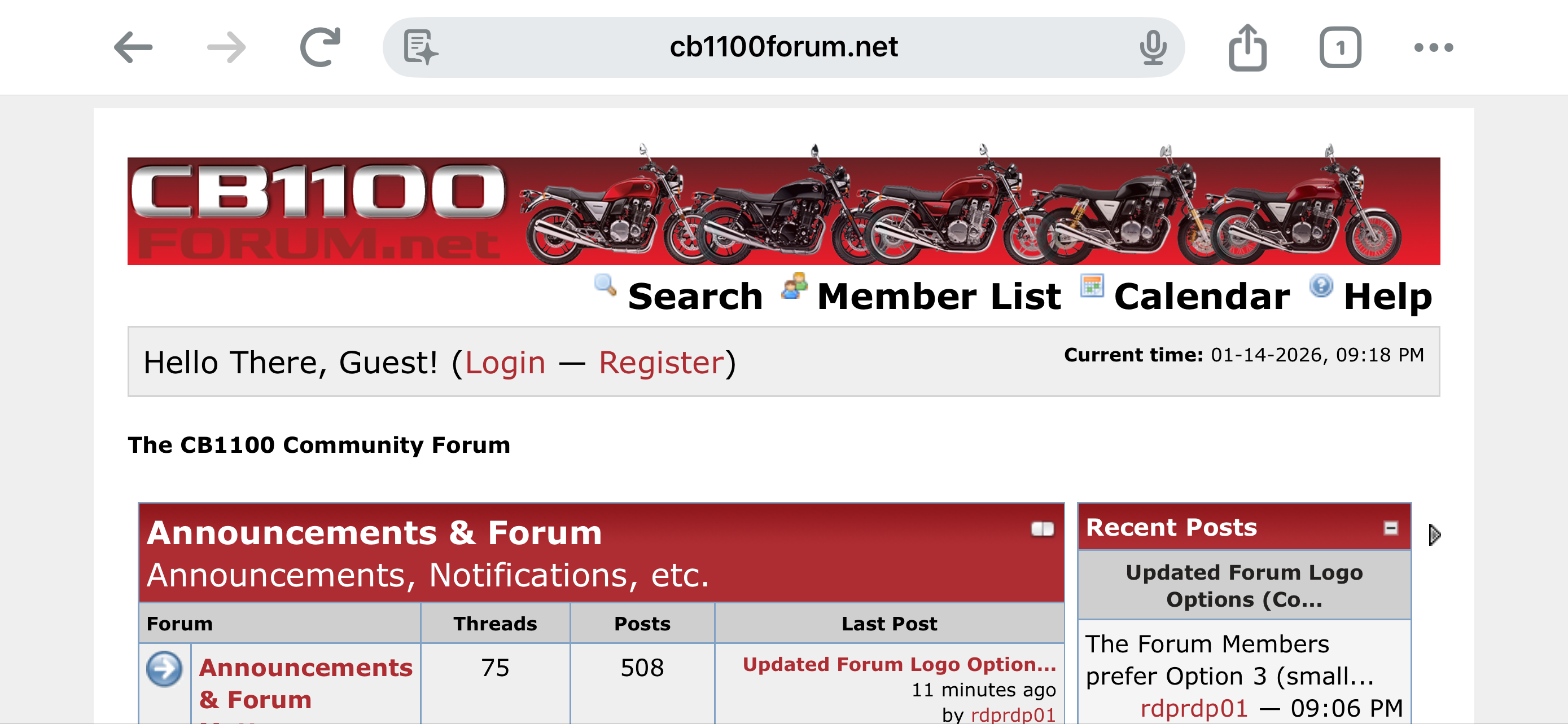
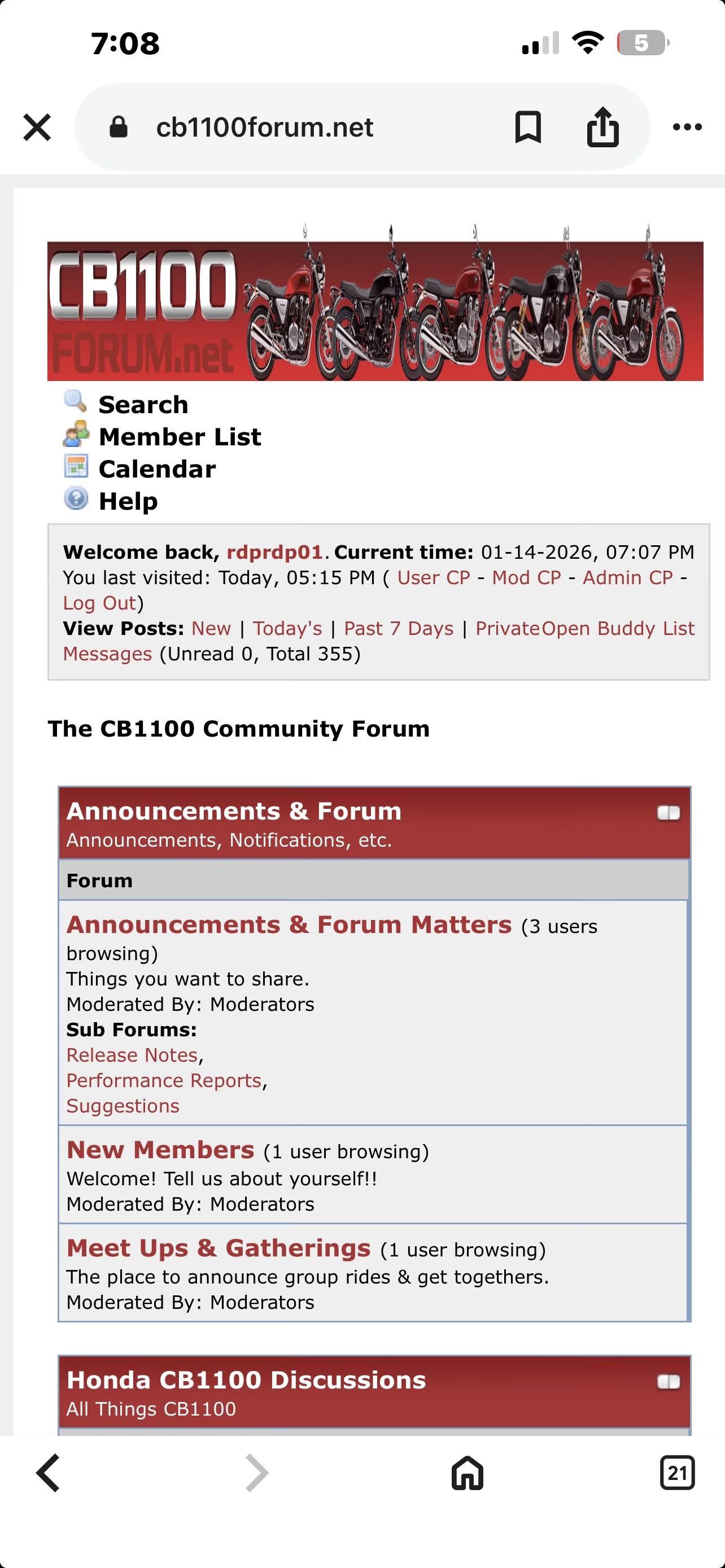
The Forum Members prefer Option 3 (smaller logo capturing the various CB1100 models). I have installed the logo on the Forum. Please clear your browser cache and it should appear. Nice work, Whoops. David
 
Thread starter
Note that the updated logo will render nicely on an SmartPhone when it is in "landscape" mode:

Pgu1o8d.png


However, if the SmartPhone is in "portrait" mode, the logo is slightly compressed.

C9klkLi.jpeg


That is brought about by the differences in screen width (portrait vs landscape) and the scaling of the logo to fit.

For laptops, tablets, and desktops, the logo rendering remains faithul to Whoops artistic vision.

Have a great evening. David
 
Yep. Good work Whoops and rdprdp01.
 
There are a few ways to fix that. The old forum, while it didn’t cater to mobile devices in particular, got around screen width variations by making the banner “X” pixels wide, then using a 1 pixel slice of the end of the banner to fill the rest of the screen to the right on larger displays. Alternatively, if you can poll device screen width and load a specific banner based on width, I can create a few variants for typical devices.
 
Thread starter
Whoops, 85% of the sesssions where the Forum Members connect, they use a laptop or tablet to access the Forum. For the remaining 15% of the sessions, a smartphone is used. If that smartphone is turned horizontally, the banner is perfect.

Without countless lines of custom code, MyBB cannot detect the orientation of a smartphone. Let’s stay with what we have now. It is a technically not possible to overcome the width pixel challenge without introducing two image files and the programming logic to select appropriately. MyBB is a little behind other platforms in this regard.

Because everyone loves what you have done, we will ask folks to simple hold their phone in a landscape / horizontal orientation for now.

I love the new banner, too, even though I voted for the Members’ Motorcyle option because I believed it promoted Community over Machine. Let’s keep what we have for six months and reassess then.

That said, let it be known that Whoops is Lord and Master of the current image. If you want to make refinements to it, feel free. I will update as you direct. Thanks again for the work. This kind of engagement helps our crew get stronger. David
 
I think it looks great the way it is now! I'm on the site on my phone just as often as a laptop, and both work fine for me. Very much appreciated for all of the efforts!
 
Back
Top